Is This The New Miami Dolphins Logo?

Now that the Dolphins are officially out of the playoff hunt we can start looking forward to the future. After we beat the Pats next week and before the draft one big item needs to be talked about… the new logo. Mike Dee promised to make an announcement on the new logo soon and I know the Dolphins nation is very worried. There has been so much speculation and concern, but let’s talk about what we know for sure.
During the Miami Dolphins Web Weekend Mike Dee talked to a group of Dolphins webmasters about the logo. He gave us three bits of information:
- The new logo would be a mix of modern and retro.
- He implied that navy would still be an accent color.
- He showed the logo to Dan Marino, Bob Griese and Nat Moore and they all loved it.
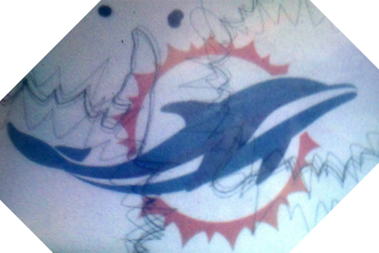
Recently I was presented with some new information about the logo. If I hadn’t been in the exact place and time this would have never come together. The first bit of information is that a Dolphins fan and friend of mine has been showing off this logo that he swore was a sketch of a design for what would become the Dolphins helmet. I didn’t put too much stock in it because it didn’t look anything like any logo I had seen and the Dolphin looked a bit too much like a whale.
Fast forward to last Sunday and I was talking to a friend who happens to work with Nike and was bragging about how they had seen the new uniforms and logo. I don’t want to say too much but their job requires seeing new uniforms well in advance of most people. They of course have to sign a non-disclosure agreement and couldn’t tell me anything except that they didn’t love the logo because the Dolphin looked too much like a whale. That seemed like too much of a coincidence and my friend who had showed me the logo happened to be standing right there. He showed my Nike source the photo on his phone and they flipped out. “How did you get that?!” the source asked. Evidently the logo he has had this whole time is “very very close” to the new logo.
Today I saw my friend again and asked to see the logo again. I took a photo of his phone with my phone and although it’s a terrible picture I am VERY confident that this is a rough draft of the logo. If you look carefully the fins are navy and there are sort of navy accents on the Dolphin. This is a sketch but like I said, I am 95% sure the Dolphins new logo is going to look a lot like the photo above.
Other bits of information I got from my source is that the Dolphins will not have an orange jersey next year and that the Vikings new uniforms are retro and “awesome”. The source seemed to like our uniforms more than the logo and hinted that they were retro, but wouldn’t say much more than that.
Now as a very loyal Dolphins fan I was conflicted about leaking what I believe to be the new logo, but I don’t think any news source would take my friend of a friend story seriously and I don’t think many people will pick up on this. But when the logo comes out I can point to this and say that DolfansNYC broke the logo first! Then again there is a small chance I am totally wrong too. So I guess we will just have to wait and see.
Lastly, I don’t hate the logo. I am a big fan of the stupid helmet on the Dolphin so I will miss that, and yeah it looks a lot like a whale, but it could be a lot worse. I am still pretty excited to see the new uniforms that my source seemed to think would be revealed at the NFL Draft. Ross had to put his stamp on this team and I don’t hate the logo and I am sure five years down the road no matter what the logo looks like we will still all love it. Go Dolphins!


December 24th, 2012 at 11:28 am
[…] to the Dolphins fan site DolFansNYC.com, there is a good chance the image you see above is a very close sketch of what the new logo will look […]
December 24th, 2012 at 5:11 pm
I’m going to miss the helmet as well. Its classic.
I’m not a fan of that dolphin at all. Has no eyes, much like most of our quarterbacks of the past 10+ years.
December 24th, 2012 at 9:38 pm
I sincerely hope that we won’t ever go with this look…Cause it’s fucking horrid.
Apologies for the F-Bomb, but good grief…
December 24th, 2012 at 10:07 pm
Certain teams uniforms should never be messed with. these include the dolphins, packers, browns, steelers, ect. And in recent year, so many teams have been going old school. this article indicates that the vikings will go down this road, as have the bills. many others have brought back throwback third jerseys. the best looking are in tampa and san diego.
so why they hell are they modernizing the dolphins? it makes no sense to me and i dont like thinking about the old logo being destroyed. the rebrand in 97 was really just an update of the same logo. this would be something new and i dont like it.
December 25th, 2012 at 12:25 am
Have you ever seen a whale?
December 25th, 2012 at 3:13 pm
Gosh, I hope this isn’t it.
What’s retro about it?
December 26th, 2012 at 9:30 am
This is ugly, leave the logo alone.
December 26th, 2012 at 10:09 am
I am more of a fan of this design myself.
http://www.dolphinslogo.com/wp-content/uploads/2012/07/Dolphins-Logo-700×327.jpg
Like you said, we’ll see the final product soon enough.
December 26th, 2012 at 10:27 am
How good is this source? Because as a Vikings fan the uniforms need to go back to the dark purple simple look. I’m sure Nike is going to make some changes, but we need more information.
Nice blog!
December 26th, 2012 at 12:25 pm
As a Buccaneers fan and someone who likes the current logo, the new logo is looks awful.
December 26th, 2012 at 1:02 pm
I am 95% confident. Especially about the Vikings thing because it came out of nowhere.
December 26th, 2012 at 3:14 pm
Least it looks better then the god awful logo the Marlins have.
December 26th, 2012 at 5:42 pm
Lifetime Dolphins fan here. I’d be open to change, but not with this logo. It’s terrible! Honestly, that’s the best they could come up with? Fail!!
December 26th, 2012 at 6:30 pm
I wouldn’t change the logo, there is nothing wrong with the logo we have now, that new logo looks stupid!! Looks like shit!! and who ever things it looks better are idiots, I myself will not buy any miami dolphins merchandise with that new logo, if thats the new logo, i will buy dolphins stuff with 1966 thru 2012 logo’s there much better, besides they need to worry getting better players and the draft, instead of worrying about a new logo, the logo should remain the classic look, why not let the dolphin fans decide.
December 26th, 2012 at 6:40 pm
Leave the logo alone it’s classic
If you want to change something,
Get rid of Jeff Ireland
December 26th, 2012 at 7:03 pm
I can only say one thing here… Marlins logo… have we not learned from our mistakes?
December 26th, 2012 at 10:31 pm
I don’t see a whale, I see a Dolphin. Not crazy about it but I can deal with it. At least we don’t have to see those ugly orange jerseys again. Am I the only Dolphin fan alive that would NOT mind if they changed the name of the team altogether?? I mean, “Dolphins”? It was cool in the 60’s & 70’s, but now it just sounds really lame, IMO. Not a good name at all for a professional football team
December 26th, 2012 at 11:54 pm
I participated in a focus group discussing the new logo. I remember seeing this one, but I think it sucks! Nothing beats the 80s look…you know the one where they actually made it to the Super Bowl TWICE. Of course the 80s style is outdated, but I just loved the bold big Stripes & Colors.
December 27th, 2012 at 12:09 am
awful…
December 27th, 2012 at 12:29 am
Being born and raised in Miami and still in S. Florida, I can honestly say, THIS LOGO SUCKS!!!…It’s bad enough we are talked about for having fickle fans, for holding on to the 72 era and living beneath the shadow of Dan Marino, to having a baseball team that sells off its championship players the following season and just recently built a new stadium for them, and to be a city that has one of the strongest followings of football from little league through college only to have a stronger Miami Heat fan base (don’t get me wrong, supported the since Hardaway, remember HOMEGROWN) to now trying to pass of a logo with a blind no eyes having hybrid ‘WALEPHIN’.
Now that the rant/vent is over….I STRONGLY PREFER THIS LOGO…
http://www.dolphinslogo.com/dolphins2013/
NOW LEAK THIS ONE!!!!
December 27th, 2012 at 2:00 am
NFL is imploding. Might as well screw up the Dolphin logo. Everything else sucks.
December 27th, 2012 at 8:48 am
I like this design. Its about time to drop the cartoon face from the Dolphin. And this in no way looks like a whate. How many whales other than Killer, have dorsal fins? This looks exactly like a dolphin.
December 27th, 2012 at 9:28 am
I’d like to see this on a helmet…if its much bigger than the current logo,say the sun is nearly the whole side of the helmet and the Dolphin wraps from front to back, that may be a cool look.
December 27th, 2012 at 9:32 am
Doesn’t Ross realize the Fins need a new GM a lot more than a new logo?!
December 27th, 2012 at 11:07 am
This is horrible! The sun is aweful and the
Dolphin looks hideous. I’ve been a fan my entire life
And if this is the new logo , I’ll cry.
December 27th, 2012 at 11:27 am
Is the Vikings a whole new uniform set or just a return of the throwback alternates?
December 27th, 2012 at 3:18 pm
Esse Quam Videri- To be rather that to seem. It’s not the logo, its not the uniform, its the quality of character and athleticism that is put INTO those. The Dolphins were significantly better this year than last. Much is left for ownership and players to do.
December 28th, 2012 at 12:52 am
That design is TERRIBLE!!
The best design out there is the one at this link:
http://www.dolphinslogo.com/finfan/
Dolphins fans need to lobby Ross and Dee to change it to the logo at that link!
Let the fans decide!!
December 28th, 2012 at 8:36 am
I hate it. It is too much of a departure from our historic logo. This looks like something for Sea World or a cruise ship not a NFL team!
December 28th, 2012 at 11:37 am
New logo is pretty cool. I think whoever is creating it should fuse the original logo and elements of the new logo together. Or, just go back to the original (old school logo). Can’t go wrong with the original.
December 28th, 2012 at 1:04 pm
not a good look
December 28th, 2012 at 4:16 pm
This is terrible, why fix something that isn’t broke, I love the current logo, this cannot happen.
December 28th, 2012 at 6:19 pm
What an ugly logo. There has not been much to root for these past dozen years, but at least the logo was cool! Do not change it! Focus, instead, on turning this teams fortunes around. I think that is a little more pressing than a logo change……and an ugly one at that!!
December 28th, 2012 at 8:59 pm
I love the current logo. Why not make the new helmets Aqua but leave the logo the same? This possible new logo looks like an Arena football logo.
December 29th, 2012 at 12:15 pm
I’ve been a Dolphin fan forever, through all the ups and downs I always support the team.
However…this new logo is UGLY! It’s the worst..i can’t believe this is the best Nike could come up with. I sure hope this is a mistake. This logo will not make our team look good.
December 30th, 2012 at 4:46 am
Hate it!
December 30th, 2012 at 2:44 pm
Wonderful logo, my community will sport this logo.
December 31st, 2012 at 5:21 pm
Gross! This logo looks like it was inspired by a 16 year old girls ankle tattoo…
If it ain’t broke, don’t “fix” it….Go Phins!
January 2nd, 2013 at 5:01 pm
This is a JOKE and unaccaptable. Mr. Ross and Mr. Dee haven’t you ruined things enough??? Try putting some talent on the field and stop trying to line your pockets. If you wan’t to get fans behind you why not try what the Baltimore Orioles did go back to the 70’s logo and it’s rich tradition. Going the way of your buddy Mr. Lorrie with the same type of lame logo is going to lose your fan base and your hopes of a money maker will be gone just like your friend Lorrie.
January 4th, 2013 at 12:57 am
This is REALLY REALLY bad. If they are going to do anything with it, add some teeth to make it a little more meaner, like the Tattoo on my arm. I get thumbs up from everyone. Please DO NOT DO the whale looking Dolphin
January 7th, 2013 at 7:13 pm
Don’t fuck with the logo. I just remodeled my basement with the other logo everywhere. This is ugly as he’ll anyway. Put more effort into building a winner then messing around with fashion.
January 8th, 2013 at 4:08 am
What can you expect from Ross. He still has some wacky affinity for Ireland.
Just because you were brought up in Football does not mean you belong there.
My first game was Dolphins V Patsies in 81′. Last time they mentioned a new logo I freaked.
The smart move was a subtle adjustment. (I took a sigh of relief)
It is one of there worst ideas yet. After watching hard knock this does not surprise me.
I have never seen a such soul less awkwardness in my life. 5 years ago the only player they should have kept on the roster was Welker. Enough said. Think I am gonna have to go with my new hometown. Go Raiders! That should say it all. Hey Ross! do not F*#k with the logo you bonehead. And kick Ireland to the curb. Football is really starting to bore me.
January 8th, 2013 at 4:13 am
Funny. I did not realize this was a New York Based Dolphins fan site until just now.
I am from the Bronx. My first helmet as a kid was a Namath helmet.
Yet I pledged my Allegiance to The Porpoise People Eaters way back.
January 8th, 2013 at 4:15 am
why not just become the Miami Sharks?
I am cool with Oli Stone.
January 8th, 2013 at 5:52 pm
OK, so we know that this isn’t it.
But man, I am concerned it’s going to be a clown show.
Let’s look at the retro uni’s: GB, SF, BUF, NYJ, NYG, WAS, CLE, PIT, KC, OAK, CHI, IND, SD (quasi-retro)
Downgrades from great uni’s: SEA (twice), TB, DEN, NE, STL, ATL (go back to the Grits Blitz look!)
Close to their old look so why bother: DET, ARI, MIN, CIN
The ugliest: PHI, JETS, BAL, NO (all black mono-uni), JAC
Who cares? HOU, TEN,
January 8th, 2013 at 5:55 pm
I am anticipating a logo that retains the current shape and look, but the Dolphin looks more life-like and is a grey/silver-ish color.
January 8th, 2013 at 11:35 pm
Like Josephus said earlier…look at how many teams have gone retro and look GREAT. I mean…who didn’t have a tear in their eye a few years back when the were celebrating the old AFL and the first game was the Patriots in their ‘Pat the patriot’ unis versus the Titans in their old baby-blue Oilers unis? Lets go for something like what we had in the ’70s. Update it a little and it could look awesome. Just look how good going retro looks on the Giants and Bills. The ‘new’ leaked logo looks like it should be for a Miami convention center not a football team…it has zero attitude and lacks a certain ‘toughness’.
Sorry to rant, but being a Fins fan from back in the 60’s I’m really concerned how this is going to turn out.
February 2nd, 2013 at 10:15 am
i wanna see multiple jerseys, black one, dark blue one,aqua,orange….get rid of the helmet on dolphin itself…fans should feel and be positive about it…lets go phins….
February 2nd, 2013 at 10:17 am
it is time for some change in design….seattles uniforms much improved now..can’t wait..
February 2nd, 2013 at 10:19 am
honestly, ross should post several professionally done logos, and let fans go vote on picking new logo and uniforms…he does want fan approval right???????? after all it is fans who go out and buy shirts,hats,jerseys !!!